What’s Milo Eating?
May 2022
A couple that I’m friends with had a new addition to their family last year: a baby boy named Milo! It was such a joy watching Milo grow up in his first year, and to live vicariously through some of his “firsts”.
Type: Static infographic
Tools: Figma, Sticky notes
Featured in:
Data Visualization Society’s Information is Beautiful Awards Longlist 2022
The process

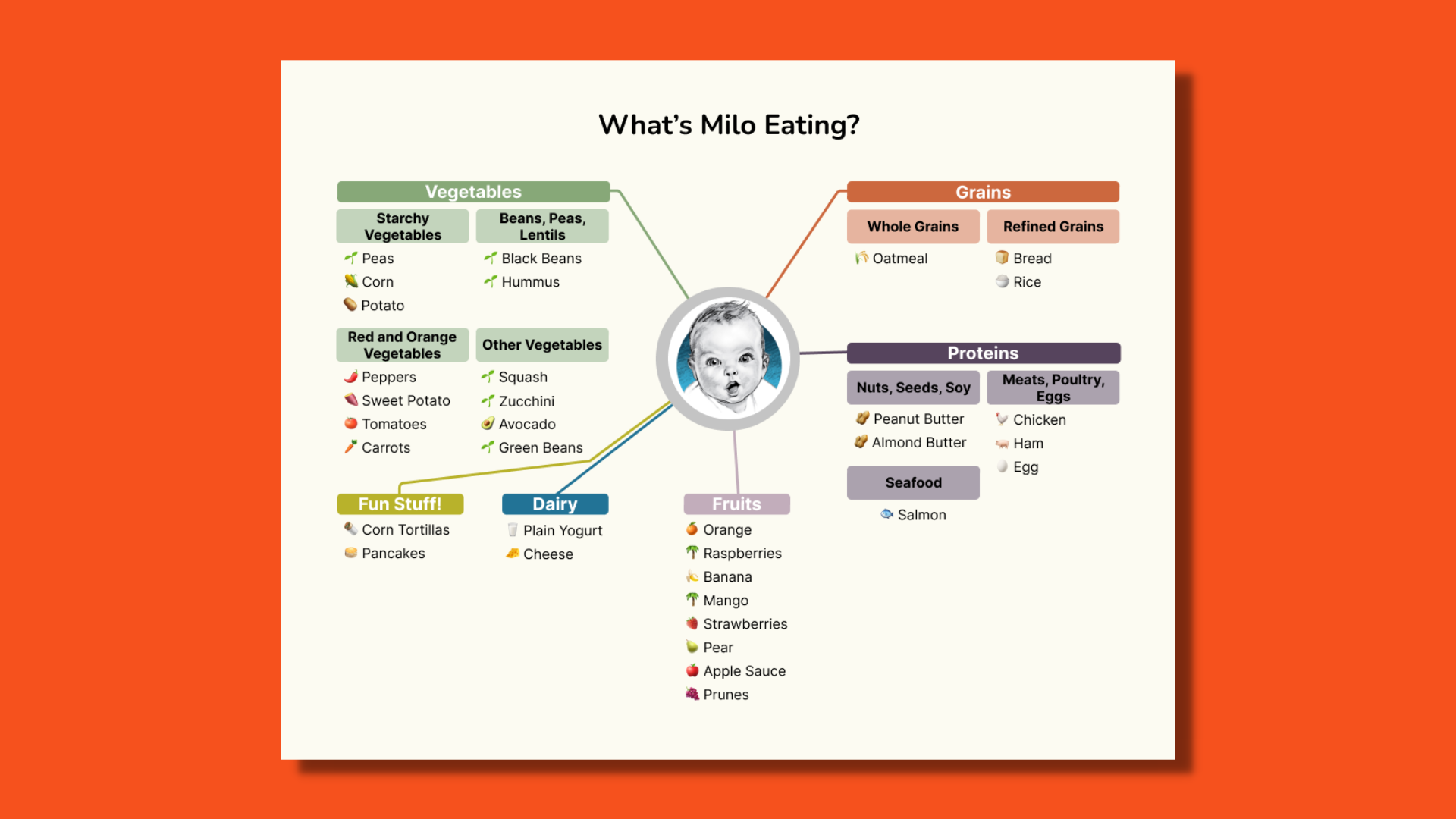
One day, I was visiting the family and noticed they had a sticky listing all the foods Milo had eaten or tried. I couldn’t stop looking through it! I thought, “There must be a way to do a fun data visualization with this!”
Normally, I would’ve sketched this with paper and pencil. My partner and I were in the middle of our cross-country move when I started working on this, so it was easier for me to sketch and quickly iterate in Figma. There weren’t a lot of other variables to use and the list wasn’t written in any particular order. I decided to stretch my creative muscle by imagining different versions of this data visualization.
I followed the USDA’s table of food groups and subgroups to better visualize the foods. This helped to add an extra layer of organization. Essentially, what I came up with was three different versions of networks graphs with the same color-coded categories per the USDA. I use the Gerber baby image for privacy reasons. Adding the emojis was probably the most fun part!


What I Learned
Milo was introduced to a lot of vegetables and fruits, and he also got to enjoy the fun stuff like pancakes! I learned that even with very limited variables, it’s still possible to create an effective and lovely data visualization. Imagine all the possibilities if time was a variable!