Harvard Business Publishing
Dashboard Design
March 2022 - Ongoing
Harvard Business Publishing is a subsidiary of Harvard University, reporting into Harvard Business School. The three market groups include Higher Education, Corporate Learning, and Harvard Business Review Group. Together, HBP produces a variety of print and digital media including the Harvard Business Review magazine and books as well as events and online learning. The focus of my role was to develop Corporate Learning’s external dashboard related to their two most popular online learning platforms: Harvard ManageMentor (HMM) and Spark.
Type: Interactive dashboard
Tools: Figma, Domo, Mural, Dovetail, Jira, Asana
The process
The issue:
Regardless of whether a client subscribed to either HMM or Spark, their admin would have access to that platform’s dashboard to track the progress of their employees’ learning. The HMM dashboard was built in-house while the Spark dashboard was built on the Degreed platform. The issue was that we had a growing number of clients who bought a bundle package that included a subscription to both HMM and Spark, but there wasn’t a central dashboard to show both HMM and Spark progress simultaneously.
The goal for building this bundle dashboard was to address reporting gaps for clients with the HMM and Spark bundle. This work would also form a solid foundation to accommodate future offerings so that clients could have a holistic view across their HBP offerings.
As a data visualization designer under the UX department, I was joining the reporting team which consisted of a Project Director, Senior Agile Project Manager, Product Manager, and a Senior App Developer. We also partnered with Domo to help reconcile the data from both platforms and to more quickly build an engaging dashboard.
Discovery:
One important piece of early feedback during discovery work was that client admins had a level of distrust of the data. This was due to a few factors:
Legacy backend development of the HMM dashboard led to discrepancies between exported Excel reports and what the dashboard was showing.
Spark being on the Degreed platform meant that we had to depend on Degreed for reporting needs, therefore less control over managing metrics.
The definitions for some metrics between HMM and Spark differed.

At the executive level, there were larger conversations happening regarding the data layer and strategies for improving it in the future. In the meantime, we were able to create a metric mapping documents to help reconcile the metrics that HMM and Spark currently had in common and to begin envisioning a MVP 1.0 of the dashboard.
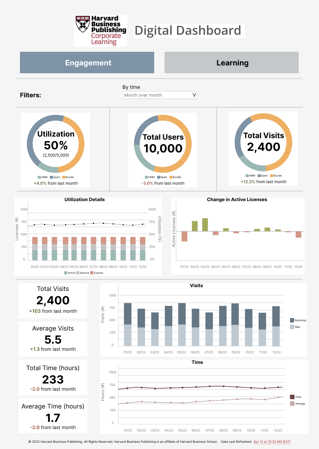
Based on our metric mapping document and conversations with stakeholders, we were able to identify the key KPI’s necessary for our MVP 1.0:
Active users
License utilization
Returning visitors vs New visitors
Visits per learner
Time spent per visit
Topic completion
Lesson completion
Chart types:
Bar Line, bubble, bullet, single value, and bar charts are the most often viewed. Consider these options before going into the more specialized types of visualizations.
Consider limiting the number of categories shown in a visualization or try lumping together smaller categories into an “Other” bucket.
Average dashboard viewership peaks at 6 different chart types.
Shorter dashboards:
Do not overcrowd the dashboard with too many visualizations. Link out to provide further investigation where appropriate.
Using linked groups of smaller dashboards has a number of advantages over keeping long scrolling lists. As you find yourself scrolling way down to the bottom to add yet another visual, stop and think about whether multiple topics are covered and whether your dashboard could be broken up into multiple dashboards.
Color palette:
About four percent of the population have some sort of color blindness, most of them males.
This color palette was inspired by HBP Brand Guidelines, Harvard Business School Brand Guidelines, and the HBP Design System. These colors are desaturated to provide consistent professional-looking data graphics for client-facing materials such as presentations and reports.
This palette was developed using Viz Palette and was designed to be as accessible as possible.
Wireframe/Prototype:
Since dashboards built on the Domo platform are in a portrait orientation and most users read content in an F-pattern, it was important that the more essential metrics were at the top with at-a-glance visualizations to quickly answer questions (what % are HMM vs Spark vs bundle? how did these numbers change from the previous time period?). I limited the chart types to mostly donut, bar, and line charts since they are the most recognized and wouldn’t impact cognitive load. I did take a little creative liberty by adding iconography for the top charts and a heat map.
Wireframes v1 - The engagement page

Wireframes v1 - The learning page
The initial round of feedback on wireframe v1 was helpful in understanding which charts were technically possible or not possible at that point in time. For instance, donut charts didn’t have the capability to have hero numbers in the middle. In a separate project, heat maps proved to be more confusing for our audience so it was scraped. While creating wireframe v2, I was quickly learning the limitations of the Domo platform and took that into account. This isn’t to say that Domo isn’t good. In fact, the team at Domo were some of the best collaborators I’ve worked with. They were constantly looking for ways to improve their offerings and took my data visualization ideas as feedback for future iterations.
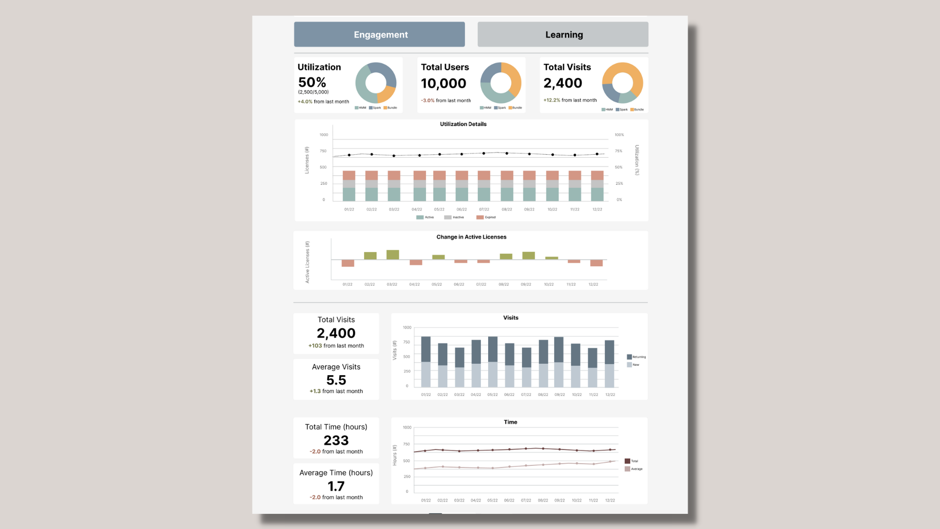
final design:
The current iteration of the MVP dashboard can be seen below. As you can see, it’s quite the departure from the previous wireframes. The main insight after several rounds of design feedback were stakeholders feeling that having a side-by-side view of HMM vs Spark metrics would be easier to read.
What I Learned
There’s still a lot of work to do for future iterations of this dashboard. The teams and I are continuing work towards trying to include more metrics, testing out more visualization types, and improving the UX. For instance, reading patterns can vary depending on a number of factors including culture, which is an important consideration for our clients who have global offices. I think there’s also room to improve on the wall of metrics that we currently have, it’ll just require more research and testing.
Overall, I’ve learned so much about data visualization/dashboard UX and I think the field is only just beginning to expand as more organizations use big data. How does cross-cultural design impact engagement? How can we create a more accessible experience beyond color palette choices? What an interesting and exciting time in this space!