
Toy Competitive Landscape
December 2017
During my time as an analyst for marketing agencies, I had created 50+ presentation decks that were used for strategy meetings with clients including Fortune 500 companies. All of the decks were data-driven. I pulled, cleaned, analyzed, and presented data visualizations. This is one example of a competitive market analysis presentation that I led the design of. Our client was a toy company and our team needed to show them that their competitors were spending more in digital advertising using Nielsen ratings data.
Type: Presentation
Tools: Nielsen, Kantar Media, Excel, Powerpoint


The Process
The start to any competitive market analysis project is data collection. I pulled data from third-party providers like Nielsen and Kantar Media to see competitors’ media spend for kids across traditional and digital marketing over the last 3-5 years. I also pulled our client’s spend and marketing data from our servers using SQL.
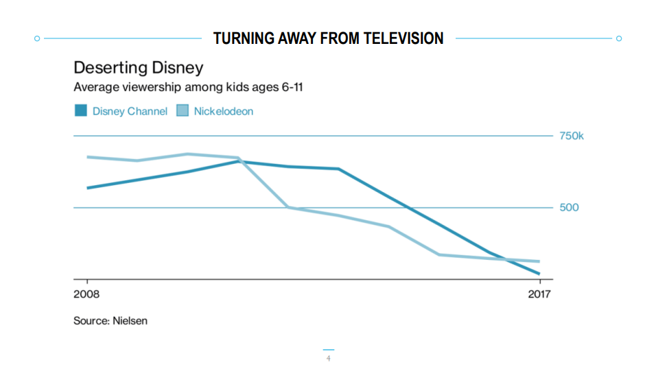
After pulling data, the data analytics team and I started to play around with the data and used Excel to quickly create charts. The purpose is to quickly visualize trends in the competitors’ media spend and compare that to our client’s spend. What we started noticing is that our competitors were spending more on digital ads than traditional (television, radio, etc.), especially the months leading up and into the holiday season. Our hypothesis was that kids’ attention spans were increasingly turning to smartphones and tablets and away from television. We were able to find studies that supported our hypothesis, especially for younger generations. One other study we found was that there are more birthdays on average during the summer months. Therefore, it was our recommendation to our client that they consider spending more on digital and consider running ads during the summer months when there was less noise from competitors.
Now that we had our narrative locked in, it was time for me to design the charts and slides. Since there were already brand guidelines at the agency, it was easier for me to spend less time on choosing a color palette and fonts. The fun challenge was designing slides and content to bring more visual variety than just presenting a bunch of bar charts.
What I Learned
While I had a small team to support the data analysis, this was the first time I led the design of the slide deck and charts. Looking back on it now, I would change the color palette to have higher contrast ratios and check if it passes color accessibility standards. What makes me proud of this project was that the Director of Analytics, Lynn, who was also my mentor at the time, said that I did such a great job with the design that I should consider doing this as my full-time job. In fact, her feedback was what inspired me to pursue data visualization as a career path 🙂