Displaced Lives, Unaccounted For
December 2021
This was my final project at Parsons for a course called “Data Vis and Info Aesthetics” taught by Ashley Treni. The theme of the final was “Visualize Uncertainties” We were tasked with starting the project by exploring two datasets around the theme of uncertainty. During my initial research on data sources, I was looking through all kinds of datasets from sources such as The Pudding, Kaggle, and Information is Beautiful. The two datasets that spoke to me were The Pudding's "Campaign Colors" and the San Francisco Rent Board's "Eviction Notices", so then I got to sketching.
Link to Displaced Lives, Unaccounted For
Type: Data journalism with static and interactive data visualizations
Tools: Miro, Excel, Flourish, Squarespace
The Process
Part 1: Final project data sources
During my initial research on data sources, I was looking through all kinds of datasets from sources such as The Pudding, Kaggle, and Information is Beautiful. The two datasets that spoke to me were The Pudding's "Campaign Colors" and the San Francisco Rent Board's "Eviction Notices", so then I got to sketching.
“Campaign Colors”


This dataset takes a look at the colors of 271 presidential candidate logo designs between 1968-2020. There’s a mix of quantitative (year, hex #’s) and qualitative (name, party, image, and whether the candidate was white/male/used red-white-blue colors) data types. Potentially, I’d like to focus on all variables because there’s not many and I think together they’ll bring interesting insights as a qualitative visualization.
The target audience could be visual designers and fans of political history. With the bar chart, some interactivity could include zooming into the candidates’ posters and scrolling to the right along the timeline. For the color wheel, it could be hovering over each wheel to see a closeup of the poster in a tooltip.
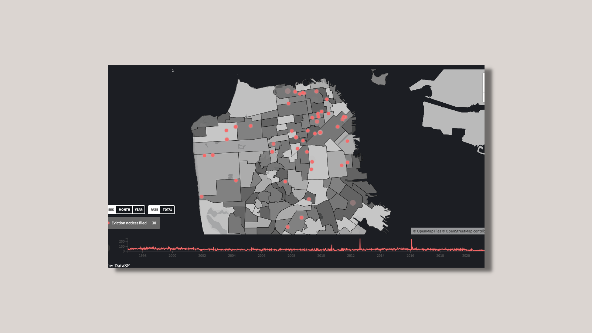
"Eviction Notices"


This dataset looks at eviction notices filed with the San Francisco Rent Board from 1997-2021. A notice of eviction doesn’t necessarily mean that the tenant was eventually evicted, so notices may differ from actual evictions. Most of the data is qualitative: address, reason for eviction notice, and neighborhood names. There’s still some quantitative data like file date, longitude, latitude, and neighborhood codes. I’ll be focusing on reason for eviction notice, date, and longitude/latitude or neighborhood names. I’m curious if these specific variables will show a pattern of certain neighborhoods filing more eviction notices than other areas over time.
Housing rights activists and organizations could be the target audience for this visualization. For the heatmap sketch, some interactivity could include a timeline that’s playable along with the ability to hover over data points for more info. For the bump chart, an interactivity could include a hover over for more info.
After careful consideration, I decided to continue working with SF Gov's "Eviction Notices" and take my investigation to the next stage.
part 2: Final project proposal
My next step was to consider my audience and find sources of inspiration before creating digital prototypes.
Visual Inspirations
One of my visual inspirations was this interactive map created by the Anti-Eviction Mapping Project. The visual elements that stood out to me were the playable/pausable timeline, the dots that would appear then stay on the map, and the big bold counter. All together, they felt impactful given the subject.

Another visual inspiration was from Alberto Cairo's book The Functional Art is an introduction to Information Graphics and Visualization. Figure 1.6 made me consider if this would be a useful graph to show the eviction notices filed by neighborhood. Maybe the Mission would be in the top three?

Contextual/Narrative Inspiration
Every year for the last six years, The San Francisco Chronicle has worked on and presented its Homeless Project, a series of in-depth coverages on the homeless epidemic. What I love about the series is that it humanizes the homeless and inspires calls to action in many ways such as photo essays, data visualizations, and long forms.
My passion is to continue building data visualizations that bring awareness to important issues. Naturally, I was inspired to create my own scrollytelling narrative with this dataset in hopes that viewers will be impacted by what they see.
Part 3: Final project prototype (iteration 1)
I utilized Flourish to help quickly visualize my data into a digital interactive prototype. I was happy with both of the initial charts. However, the styling and visual choices still needed finetuning. Plus, I needed to start working on my narrative.
Feedback from classmates:
Were there months or seasons to peak evictions?
It's a bit difficult to see the particular neighborhoods that were more severely impacted - could a heatmap help? Combining both graphs would be really impactful.
Part 4. Usability testing & prototype (iteration 2)
With my initial digital prototypes ready and inspiration from data journalism long forms like the Chronicle's Homeless Project, my next step was to create and refine my scrollytelling experience.
During my research into the San Francisco Rent Board's "Eviction Notices" dataset, I found a Chronicle article that noted the dataset didn't include public data on unlawful detainer lawsuits and sheriff's evictions. This led me to do more research on the California eviction process, the complicated legal processes, and how it impacts the homeless population. Next, I came across a Bloomberg article that explained how the methodology behind the HUD's required census on the homeless population is flawed.
Between both articles, it led me to the main thesis for my website: that publicly available datasets around evictions and homeless in San Francisco are inaccurate, which affect at-risk individuals and families already compounded by the COVID-19 pandemic and the end of the eviction moratorium.
Feedback from classmates and professor:
Temporal nature of the dots feels like an interesting juxtaposition.
Heatmap might be a really good idea because we can see the density. It's actually compounding.
Could we group the neighborhoods further?
Are there other ways to visualize the "ghosts" or that we're only looking at a portion of the dataset? Give more visual space to the "missing piece".
Final project visualization and prototype
Link to project

What I Learned
This was such an interesting project where, for the first time, I was questioning data collection and ethics around evictions and homelessness. I wanted to emphasize that behind each data point is a person or family at-risk of homelessness, and to change the perception of what the homeless population could look like. Visualizing “missing” data was really challenging within the given time frame. If I were to take next steps, it would be to collect and visualize the “missing” data on unlawful detainer lawsuits and sheriff’s evictions, and to do further analysis.